06 · Energy Drink · Brand Identity · Campaign
MR.DEER
Client
MR.DEER
My role & scope
Brand designer — identity, product presentation and campaign design
Services
- Brand Identity
- Product Presentation
- Campaign Design
Brandandcampaigndesignforanenergydrink—hardtype,deepblackandoneuncompromisingaccent.
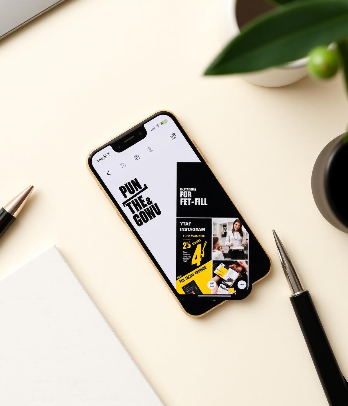
An energy-drink brand built for high-contrast environments: a bold typographic system, a black-and-accent palette, and product presentation designed to hold attention on a shelf and in a feed.
The brief
Thebrief
Design a brand and campaign language for an energy drink that feels bold and high-energy, and stays recognisable across can presentation, posters and social layouts.
The approach
Theapproach
Rules over decoration. A strict typographic grid with one flexible content slot keeps every layout on-brand, whether it's a can render, a poster or a social tile.
The outcome
Theoutcome
A consistent brand and campaign system covering product presentation, poster layouts and social templates, all drawn from the same typographic rules.
Deliverables
Whatshipped.
- Brand identity & typographic system
- Can and product presentation
- Campaign poster layouts
- Social layout templates
Next step
Wantsomethinglikethis?
Tell me about your business and what you'd like to change. I'll come back with a clear proposal.