
Whymostidentitiesdieinthehandover.
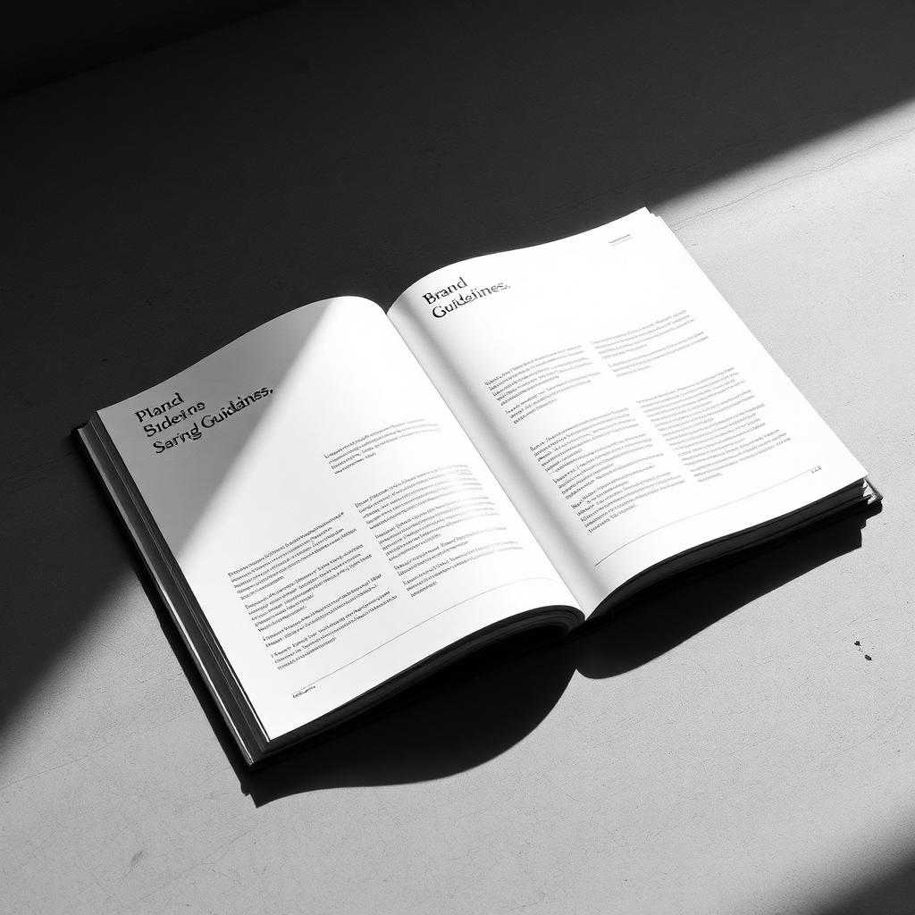
For years I treated handover as an admin task. Zip up the files, write a two-page PDF, wave goodbye. Then, six months in, I'd catch a glimpse of the brand in the wild and barely recognise it — the wordmark stretched, the palette abandoned, the type substituted for whatever the intern had on their laptop.
I used to blame the client. Now I blame the handover. If the brand can't survive a Tuesday afternoon at their office, that's a design problem, not a discipline problem.
“A brand is a hundred things. A system is the ten decisions someone has to make well for the other ninety to fall into place.”
The system has to be smaller than the brand.
If your guidelines are fifty pages and require a designer to interpret, you have not delivered a system — you have delivered homework. The rule I follow now: every guideline document has to fit on a phone screen at reading size. If a rule can't be stated in one sentence, it isn't a rule yet.
I write each rule as an imperative. "Wordmark sits on the baseline of the second line." "Body copy is always left-aligned." "Photography is one light source, always from the left." A rule the client can repeat in a meeting is a rule that survives.
Ship templates, not principles.
Principles are lovely. Templates get used. For every identity I ship a working set — social tiles, letterhead, a slide deck, a print spec, an email signature — that the team can copy and edit on day one. The principles live at the front of the document for the day they hire a designer. The templates live at the back for every Monday morning between then and now.
Abrandiswhatsurvivesthehandover.
Motion belongs in the guidelines.
Most brand books treat motion as an afterthought — a two-line note about "smooth transitions." But motion is the thing the customer feels first, before they've read a word. If you don't specify it, someone will invent it, and it will be wrong. Ship an easing curve, a duration, and one example. That's enough.
The last meeting matters more than the first.
I now book a two-hour session six weeks after launch. No new work, no invoice — just a walk through what the team has actually made with the system. Nine times out of ten, the fixes are tiny: a template nobody knew existed, a rule that needed rewording, a font file that never got installed on the marketing manager's laptop. That two-hour session has saved more identities than any deck I've ever built.
It is not glamorous. It is the difference between a rebrand and a brand.