Thebriefisadrawing.

I used to write briefs the way most people do: paragraphs of objectives, audiences, tone-of-voice adjectives. The client would nod, I would start work, and three weeks later we'd realise we'd been describing two different projects. The paragraph is the problem. A paragraph can hide almost any disagreement.
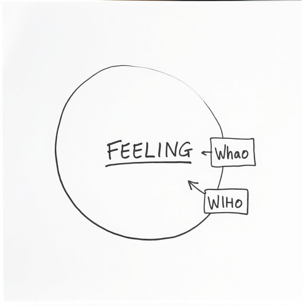
Now every brief starts as a single-page drawing. Boxes for what the brand does, arrows to who it does it for, a shape in the middle for the feeling. If either of us can't fit the whole project on one A4 sheet, we're not ready to design yet.
“If either of us can't fit the whole project on one A4 sheet, we're not ready to design yet.”
Draw the outcome first.
The best exercise I've stolen: before we agree scope, we sketch what a review of the project would look like a year after launch. Not a mockup — a page in a design annual, or a quote from a customer, or a headline about the brand. That imagined outcome is the brief. Everything after it is choice of medium.
It sounds like a party trick. It isn't. When you force the conversation to end with a concrete artefact — a spread, a shelf, a screen someone actually holds — the abstract adjectives fall away. "Approachable" becomes "the person on the packaging is smiling." "Premium" becomes "the paper is thick enough that you feel it when you pick it up." You can design against that. You cannot design against a mood board.
The three shapes I keep coming back to.
After a hundred of these, the drawing has settled into three shapes. A rectangle for the offer — what the brand actually sells. A cluster of small circles for the audience — who it's for, drawn as specifically as possible ("a 34-year-old buying her first serious skincare," not "women, 25–45"). And a single large shape in the middle for the feeling — always the last thing we draw, always the hardest to name.
The brief is a contract, not a wish list.
Once we've drawn it, the sheet goes on the wall for the length of the project. Every decision has to point back to something on it. New idea? Show me the arrow. New audience? Show me the circle. If the sheet doesn't have room for it, either the sheet is wrong or the idea is out of scope. That's the whole system.
The unglamorous truth is that most of the value I add now happens in the first hour of a project, with a marker, before I've opened a design tool. Every project since I made the switch has been shorter, cheaper for the client, and — for what it's worth — better.